
The Bone Collector’s Typeface
Purpose
To create a harmonious typeface solely out of illustrations of human bones.
Client
Sheila Greenland
Date
December 2019
Medium
Typeface/Poster
Tools
Photoshop, Procreate
Primary Audience
Lay
Ideation & Rough Sketches
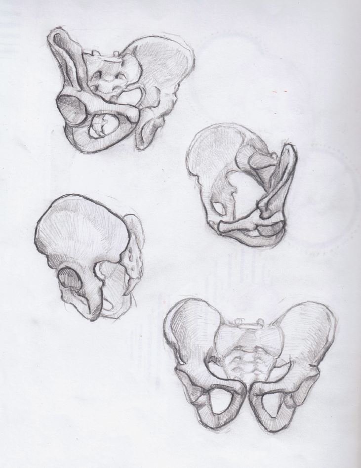
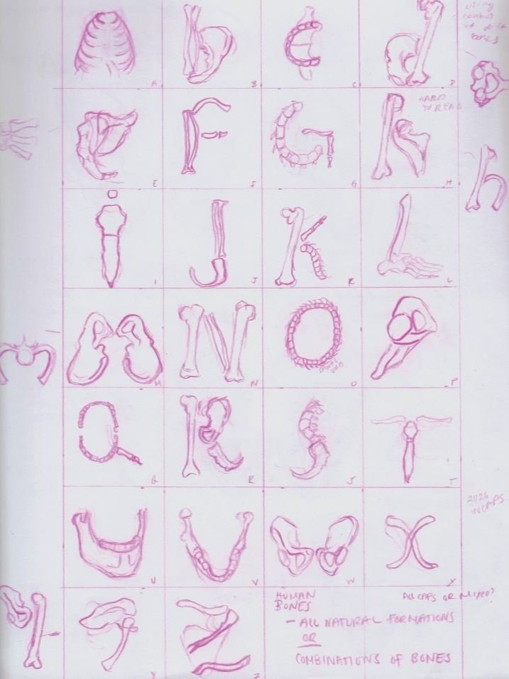
The idea for this project originated from rough sketches of bones/bony fragments, which when drawn in certain orientations, resembled letters. These sketches sparked the idea of creating a typeface using different human bones to create letterforms.


Letterform Iterations
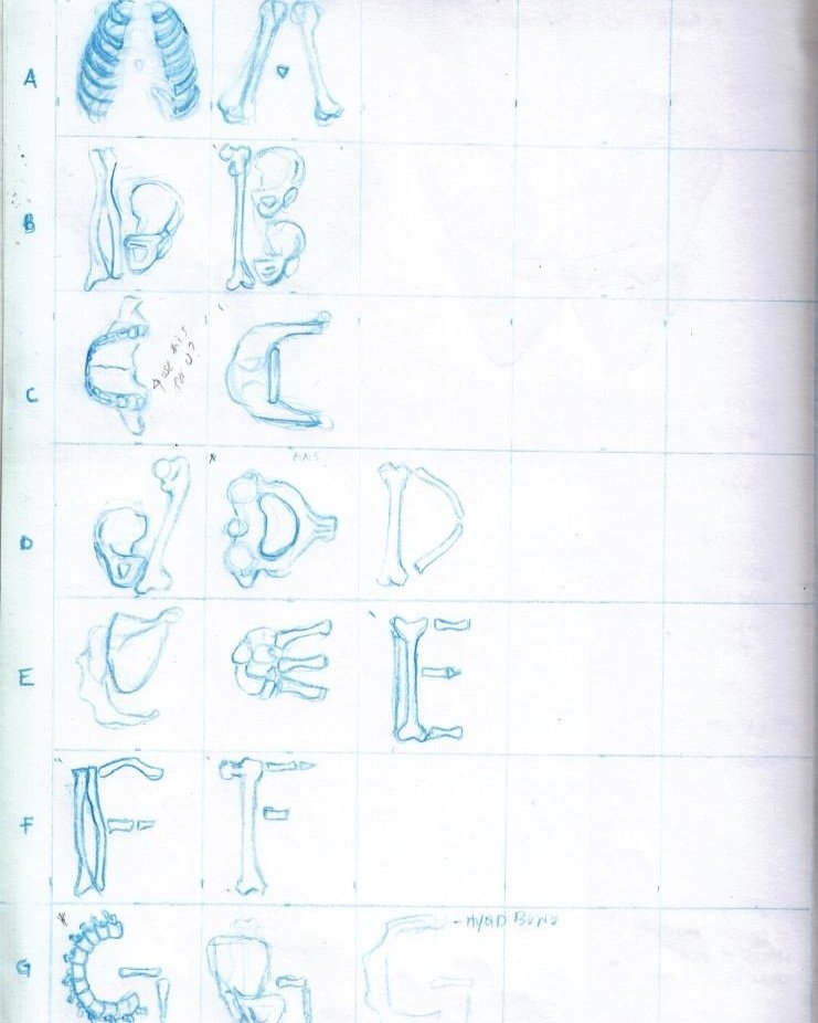
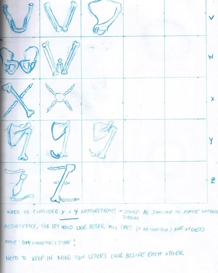
A variety of bone combinations were tested to create the most legible and visually pleasing forms to fill an entire uppercase alphabet.
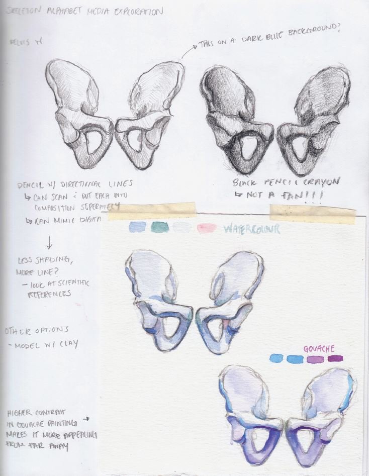
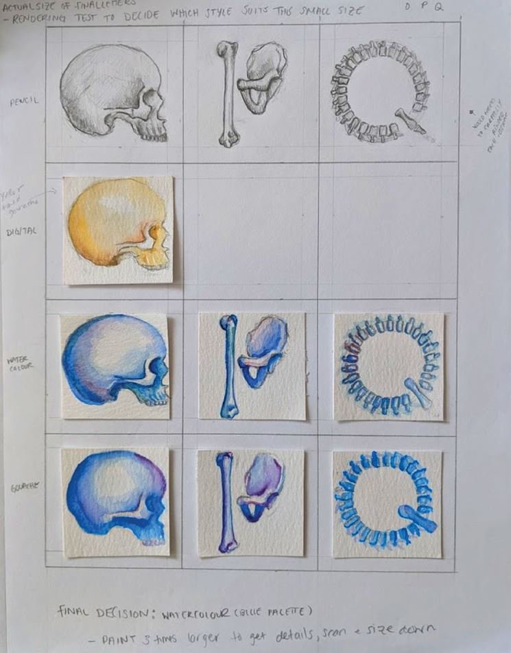
Render Tests
Different traditional media were tested to determine the look and feel of the final illustrations. Ultimately, cool-toned watercolour was selected for the final rendering stage.

Rendered Watercolour Illustrations
The letters were sketched and rendered on separate sheets of watercolour paper. Due to the repetition of some bones, some letters were able to be skipped during the rendering stage. The final illustrations were scanned, cleaned up, and arranged in Photoshop.
References
Marieb, E. N., Wilhelm, P. B., & Mallatt, J. (2017). Human Anatomy (8th ed.). San Francisco, CA: Pearson Education.