

Bone Bio
Purpose
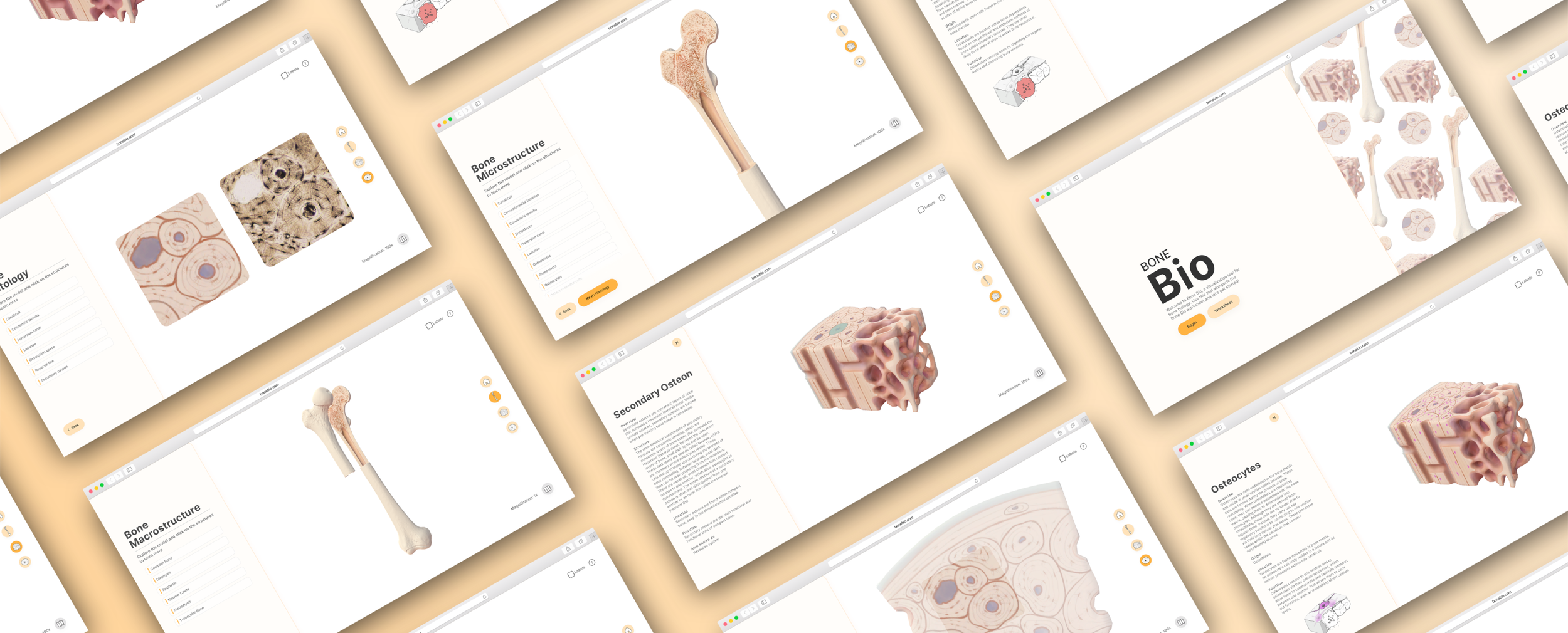
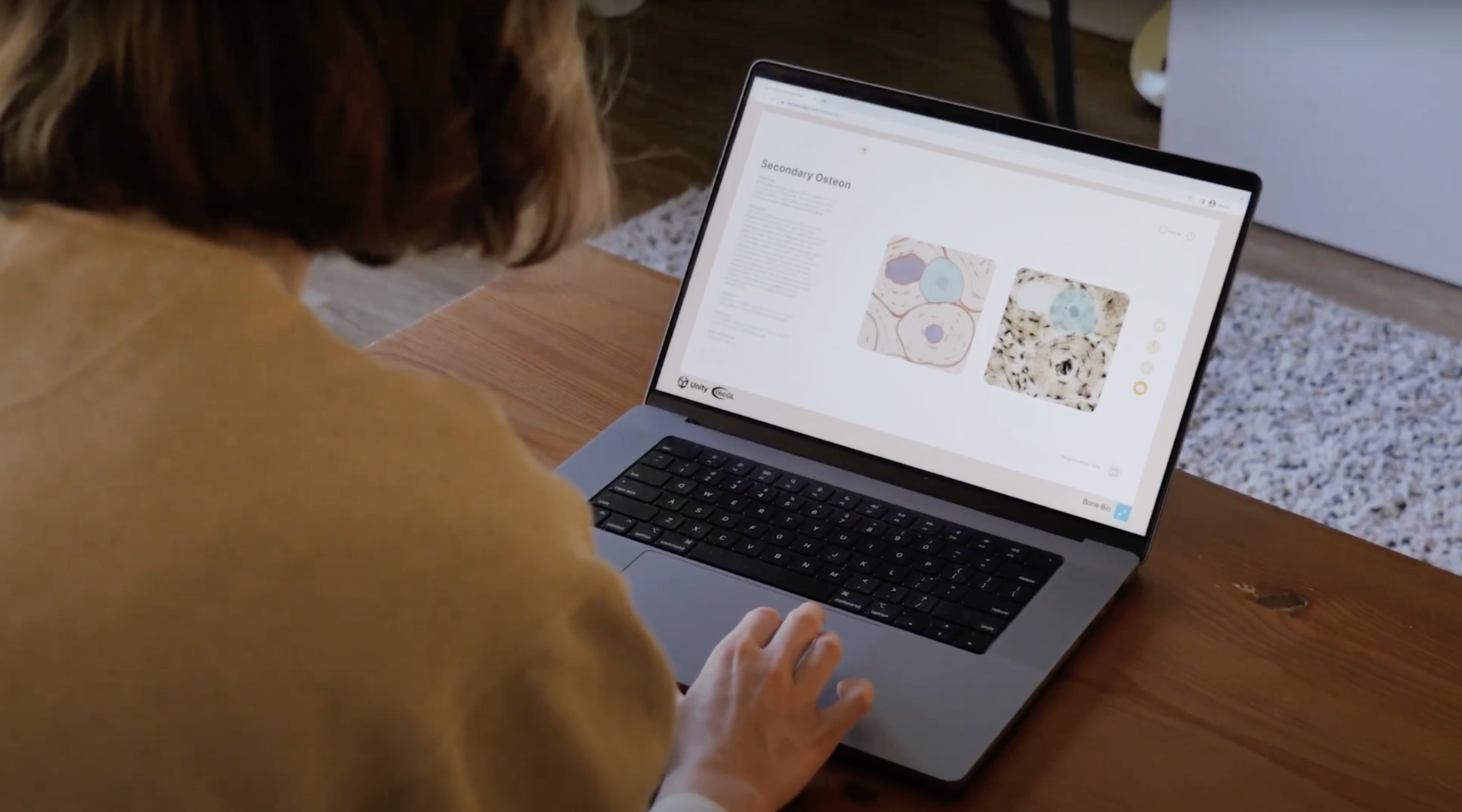
Bone Bio is an interactive bone biology learning tool that invites students to explore 3D models of bony structures at different levels of magnification. It is a web application accompanied by a physical worksheet that is designed for and is actively being used by 3rd-year undergraduate Forensic Anthropology students enrolled in ANT334H at the University of Toronto Mississauga.
Click here to access the functional prototype!
(Password: bone)
Client
Dr. Tracy Rogers
Supervisors
Marc Dryer
Michael Corrin
Roles
Researcher, Writer, UI/UX designer, 2D/3D artist, Unity developer
Date
May 2021 — July 2022
Target Media
Website + Worksheet
Tools
Figma, Procreate, Adobe Photoshop, Zbrush, Maya, Unity
Primary Audience
Forensic Anthropology students enrolled in ANT334H
Media Audit & Research
This project originated due to a need for a bone biology supplemental learning tool in ANT334H at the University of Toronto (U of T), a 3rd-year human osteology course taught by Dr. Tracy Rogers. Over the years, students have had difficulty with this section of the course, noting that students showed difficulty understanding the relationships between bony structures at different scales, as well as difficulty drawing these structures. I began the project by assessing the materials that were currently available to students, which included videos and websites. An issue that was seen across these media was that they often did not cover the content to the degree of detail needed by Dr. Rogers, as well as some images mislead the viewer to think that certain structures were in incorrect locations. During this media audit, I discovered that there were no interactive learning tools for bone biology that were openly available to students.

User Research
Although the instructor of the course saw a clear need for a novel learning resource, I wanted to hear directly from students. I sent out an anonymous questionnaire asking about their learning experience during the bone biology lecture and the learning challenges that the students faced when studying at home. From this questionnaire, I found that:
Students needed additional visual resources
First-time learners are overall not very confident with the topics presented in class
Students are not very confident with histological examination and do not feel confident enough to draw these structures without a reference image
Students want to see practice questions and histological image comparison in the future bone biology tool
“Personally, it felt rushed. I would have liked more time to process the information in order to better understand how this information fits in to the bigger scheme of what we are learning in this class.”
“I like the pictures presented in the lecture, but when they are taken out from the posted outline, I have nothing to reference and struggle to find my own, or find correct pictures matching to the information I need”

Solution:
An interactive tool that utilizes animation to maintain orientation between scales + a physical worksheet
To help students study after lecture, I came up with the idea of creating a web-based bone biology visualization tool that utilizes animation to transition between different scales of bone. From my media audit, one key strength of animated videos was that they helped keep the viewer oriented by zooming in and out of structures; however, bone biology is a complex topic, and the content can only be covered very superficially by a 3-5 minute long video. By tying together sections of an interactive tool with animations, it would help to maintain orientation between the scales, while also allowing students to take their time to learn about all of the structures at their own pace. This tool paired alongside a physical worksheet would allow students to test their knowledge by drawing, labeling, etc., and would be an optimal format for the instructor to change over time, rather than changing practice questions in the tool.
User Journey
The topic of bone biology was broken down into 4 main sections for the visualization tool. This allowed me to create a user journey that would help get a better sense of how I would go about tying together these sections.

Visual Inspiration
When thinking of the look and feel for Bone Bio, I was heavily inspired by simple UIs, low-poly models, and inviting colours.

UI Design
At this stage I iterated on the UI design, incorporating placeholder illustrations for where the models would later be added. The design was kept clean and simple, with minimal colour as to not take away from the soon to be full-colour models that would be implemented during development.

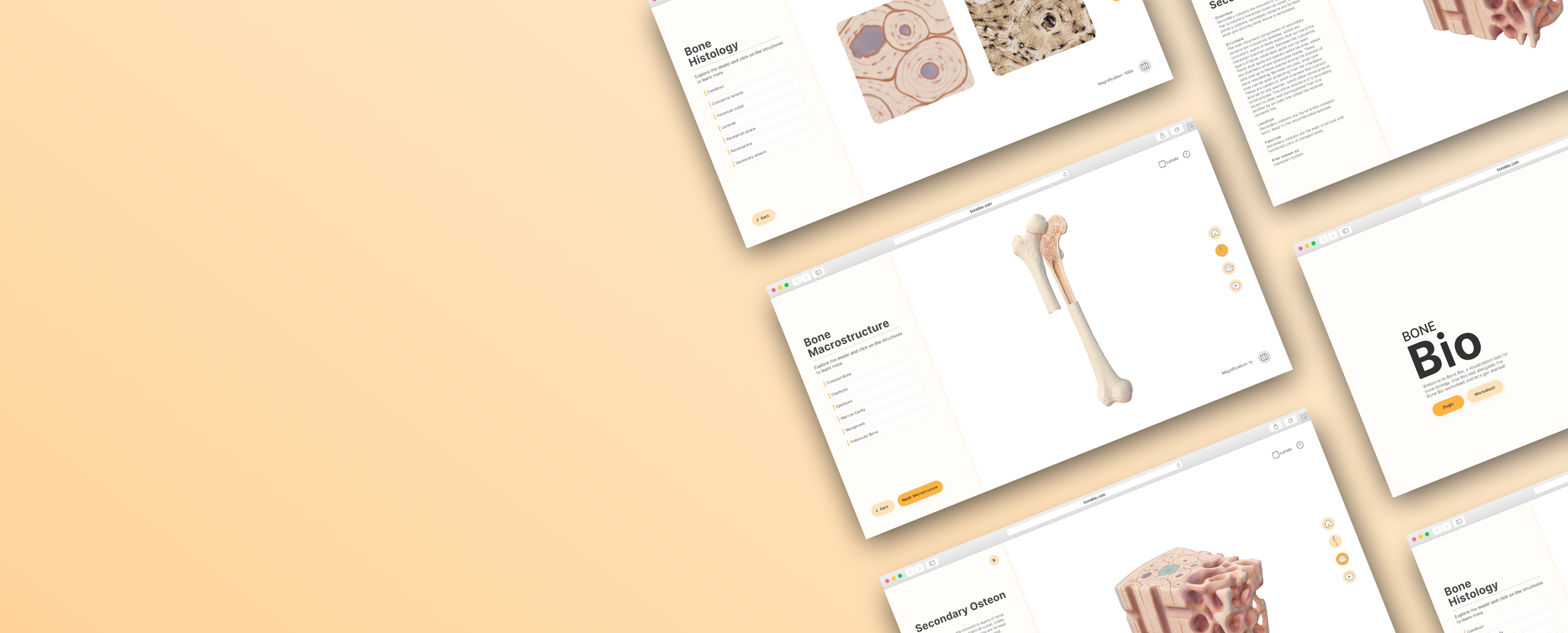
Module List Screen
The main interface that a user encounters in Bone Bio is a module overview that contains a list of clickable structures on the model. Users can interact with the model on the right, rotating and zooming in as needed, and can hover and click on specific structures. If the users are having difficulty, they can either click on a structure within the list to bring up the description and show them where it is, or toggle on the labels at the top right. When users go between sections, either using the back and next buttons or the navigation bar, the model and the module title change.

Structure Description Screen
Once a structure is clicked, the left side panel changes to a description of the structure. Once they exit out of the description panel, they’ll see that that the list item they clicked on is greyed out so that they know that they’ve already looked at that structure.

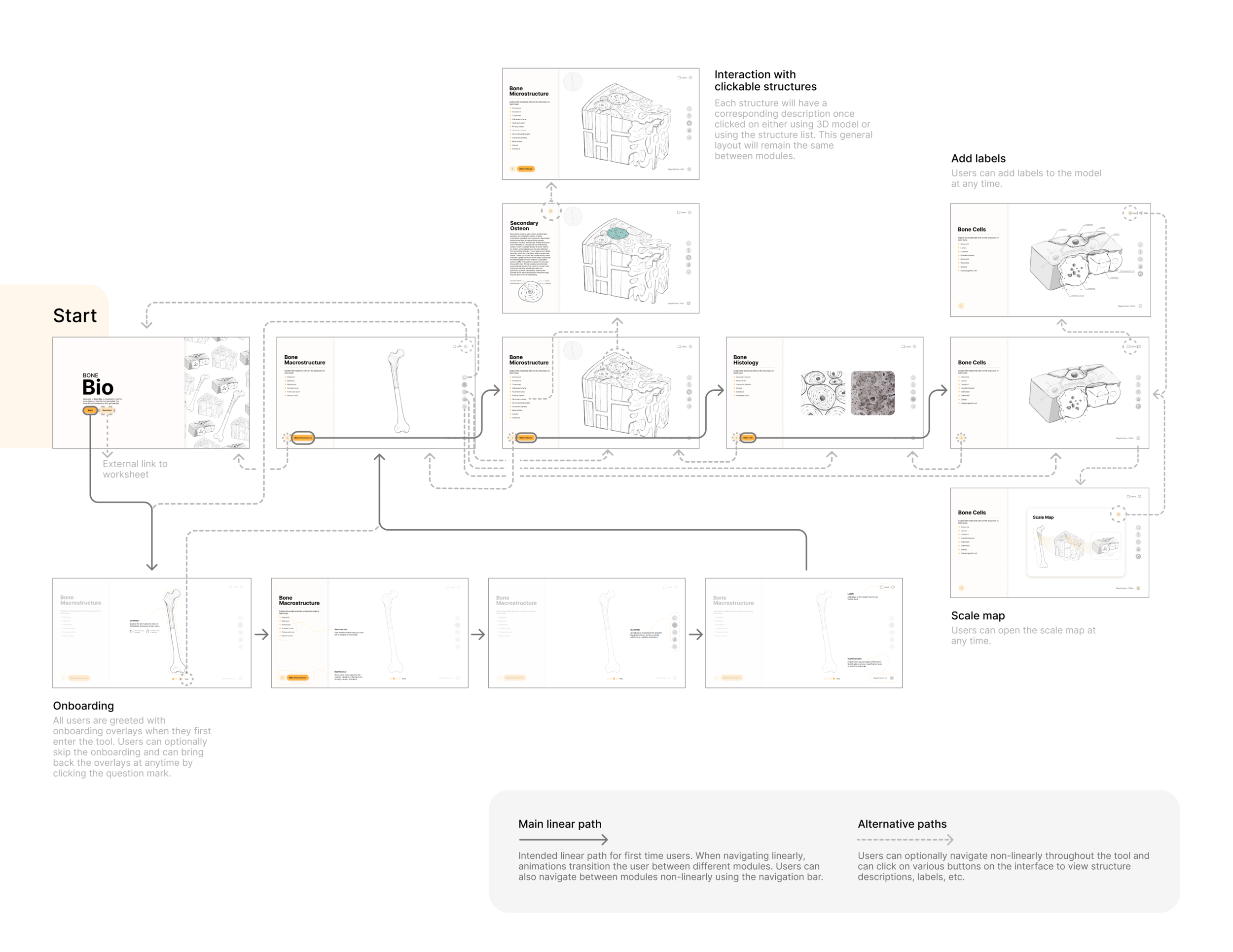
Flow Diagram & Interactive Mockup
After all of the wireframes were complete, I created a flow diagram to show the app from the user’s perspective and how each element connected to one another. I later created an interactive mockup from my high-fidelity wireframes to use for user testing and to get final feedback from the client before transitioning into the development stages. We ended up removing the final section of the tool, the cell section, and opted for a heatmap overlay in the microstructure stage, as it was more useful for students to know where certain cells were located rather than what they looked like.
User Testing
Using the interactive mockup I created in Figma, I conducted extensive userability testing with students. Each session included a list of tasks that students were asked to complete a set of tasks, talking through their logic and their feelings while they completed them. Usability testing for Bone Bio revealed that it succeeded in the majority of the tested areas; however, several deficiencies were identified. Areas where the learning tool succeeded in were the navigation, transition animations, accessing information about bony structure, and the labels function. However, it also unveiled deficiencies in the onboarding, scale map, transition animation, histology section, and UI, all of which I altered based on this feedback before moving on to development.

Asset Development
In tandem with developing the learning tool in Unity, I began developing the 3D assets using ZBrush and Maya. One of the biggest challenges was optimizing the models for Web - this was especially challenging when it came to the bone tissue cube, as the trabeculae were a challenge to maintain their interesting forms while also having good UV maps for textures. I later used Procreate to paint the models and give them a unique colour palette and style.

Unity Development & Animations
One of the major challenges during development was implementing the transition animations into the tool. One of the options I was considering was rendering 3D animations and playing them once users navigated to the next section; however, this posed its own challenges, particularly with consistency, as it would be very challenging for the models to have the same lighting and rendering if done outside of Unity. Instead, I chose to code the animations directly in Unity, so that once the User navigated to the next section, the transition felt seamless.

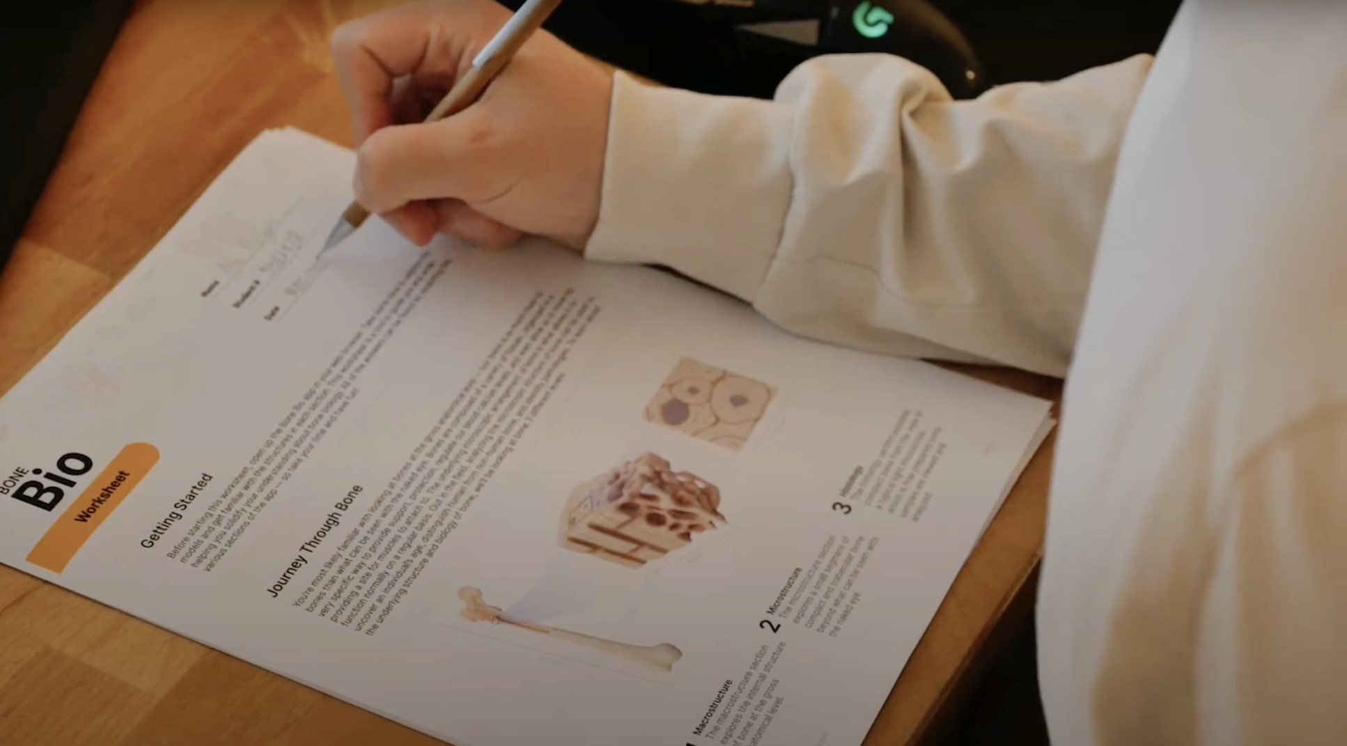
Worksheet Design
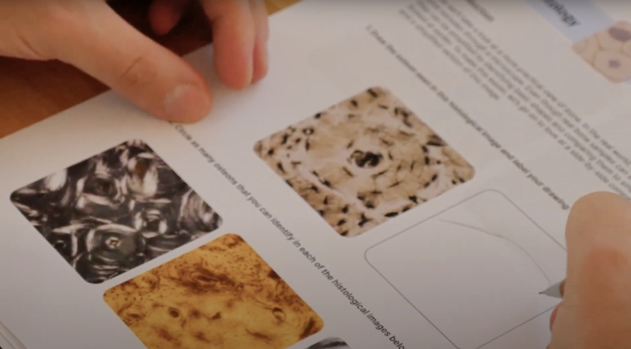
Using the course material and previous exams, I created a worksheet to accompany the tool. This worksheet contains drawing, labeling, and short answer questions for students to test their knowledge as they navigate through each section. Instructors can also choose to make the worksheet a part of the laboratory component of the coruse. Throughout the worksheet, I was able to leverage some of my existing sketches that I originally created for my wireframes to use as colouring/labeling questions for students. I also put a particular focus on questions that students typically struggled the most with in previous exams, such as labeling and identifying structures in histological images.

Completing Development
After implementing the UI, 3D & 2D assets, animations, I added the finishing touches to the Unity prototype and conducted a small round of informal user testing to determine any bugs.

Making the Tool Accessible to Students
After completing development in July of 2022, I made the tool accessible using itch.io. It can be accessed here using the password: bone. Students can launch the web app and use the tool. It is currently considered a prototype as even though all of the models and information have been implemented, some of the smaller details such as non-linear navigation, labels, and the tutorial screens were not implemented in this version of the tool.